Home > Hakushika Brand Story > Logo Explanation
Logo Explanation
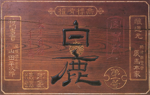
In 1877, the Tatsuuma-Honke Brewery adopted the name "Hakushika" as their key sake brand. Written in classic, elegant Japanese script, the characters "白 haku" (white) and "鹿 shika" (deer) were carefully chosen to evoke a feeling of longevity, luxury and mystery.

Today, we still use those same beautiful characters in their original script in honor of the generations before and in desire to inspire the generations after. Our Hakushika brand colors, the stark combination of black and white, are used to communicate the concept that Hakushika Sake, like the transparency of the purest of waters, is a subtle, yet significant embodiment of the essence of Japanese aesthetics.

